Think red toys are irresistible to cats? Think again. I used to buy bright red balls for my cat, thinking she'd leap for them. Ever watched her whiskers twitch at a rolling toy you thought was bold? She barely glanced up, um, true story.
Cats actually see blues and bluish-greens best. Reds, lots of oranges, and browns often look muted or gray to them. That’s because red can be less saturated (how bright and pure a color looks) for feline eyes, so colors feel softer. Cats rely more on brightness (how light or dark a color is), contrast (the difference between light and dark), and motion. Movement and sharp light-dark changes catch their eye.
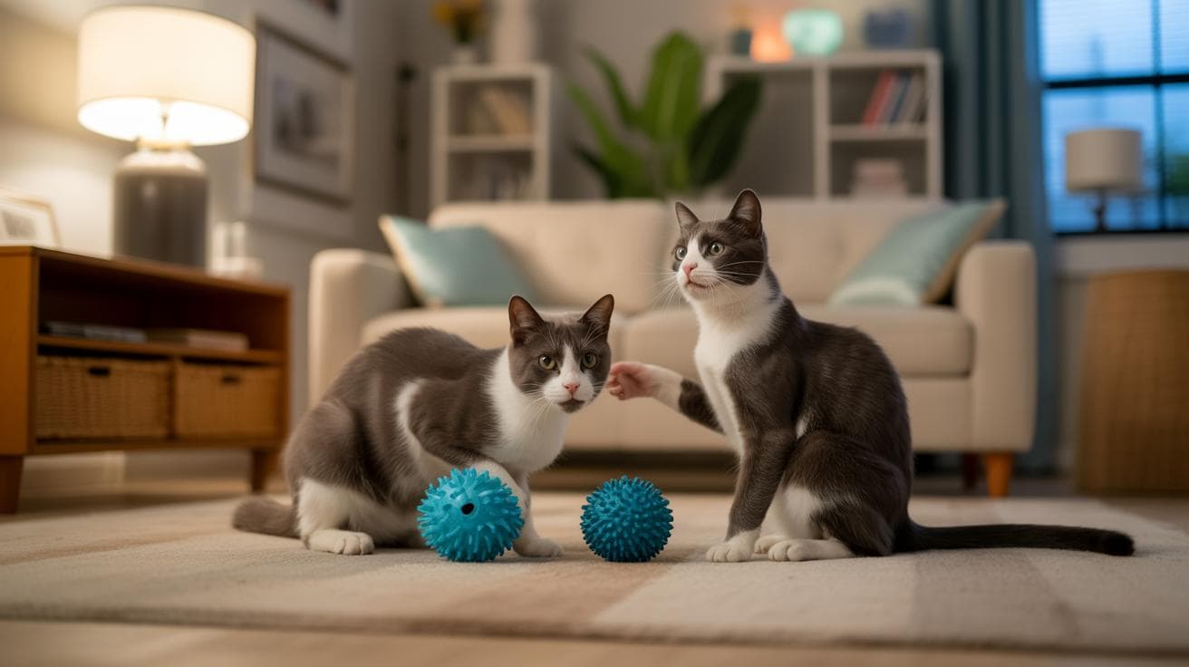
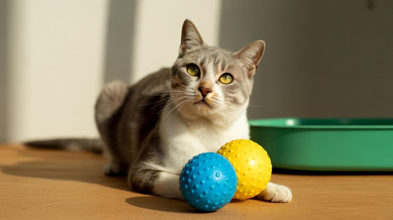
So pick toys in blue, teal, or yellow, and go for high-contrast spots or stripes so your kitty actually notices them. Add motion, a wobble, a roll, or a feather on a string, and you’ll get pounces, flips, and full-on zoomies. Worth every paw-print.
Quick answer: colors visible to cats
Short version: cats best see blues, bluish-greens and some yellows. Reds and many oranges or browns look muted (less bright) or gray to them, so a red toy can read as a dull shape instead of a pop of color.
Cats’ color world is less saturated (less intense color). That means brightness, contrast and motion matter more than hue (the actual color). Ever watched your kitty’s whiskers twitch as a ball rolls across the carpet? It’s the movement and the light-dark jump that get them every time.
Practical tip: pick blue, teal or yellow toys, collars, and markers, those show up reliably. Use strong contrast (clear difference between light and dark) so the item stands out, like a bright blue toy on a beige rug, rather than relying on red or brown. Worth every paw-print.
How cat color vision works: cones, rods and reflective layers
Cats are dichromats, which means they have two working cone types instead of the three most humans have. That two-cone setup narrows the range of hues they can tell apart. I put the more technical notes and sources in the next bit if you want the nitty-gritty.
Compared with people, cats have roughly ten times fewer cone cells (cones are the color-detecting photoreceptors) and a much higher rod-to-cone ratio. Rods (the light-and-motion receptors) help them see in dim light, and their pupils open wide to let in more light. They also have a reflective retinal layer called the tapetum lucidum (a mirror-like layer behind the retina that bounces light back through the eye) and a field of view of about 200 degrees with useful binocular overlap. All this makes them excellent at spotting movement and contrast, but not great at rich color or sharp long-distance detail [1–4].
Perceptually, that anatomy creates a world with softer colors and stronger focus on brightness, contrast and motion. Your cat sees dim shapes and flickers much better than subtle color shifts. Up close, colors can blur or lose their vividness faster than they do for human eyes.
Cones and wavelength sensitivity
Cats have two cone types: a short-wavelength cone (blue-sensitive) and a second cone shifted toward green-yellow. Exact peak sensitivities and how much the two overlap are still debated by scientists. Reds and many oranges weakly stimulate these cones, so those colors often look washed out or gray to a cat. Think of it like turning down the saturation on a photo.
Rods, tapetum lucidum and low-light vision
Rods dominate the feline retina, making them superb at detecting motion in low light. The tapetum lucidum (that reflective layer) gives photons a second chance to be caught by the retina, and big flexible pupils fine-tune how much light gets in. Together these parts let cats hunt at dusk and dawn, they see well when it’s dim, but with less color fidelity and lower distance sharpness than we do. Ever watch your cat track a tiny moth at dusk? That’s the combo working.
Colors cats see best , concise color-by-color notes
Quick perceptual notes below (see the physiology section for anatomy and citations).
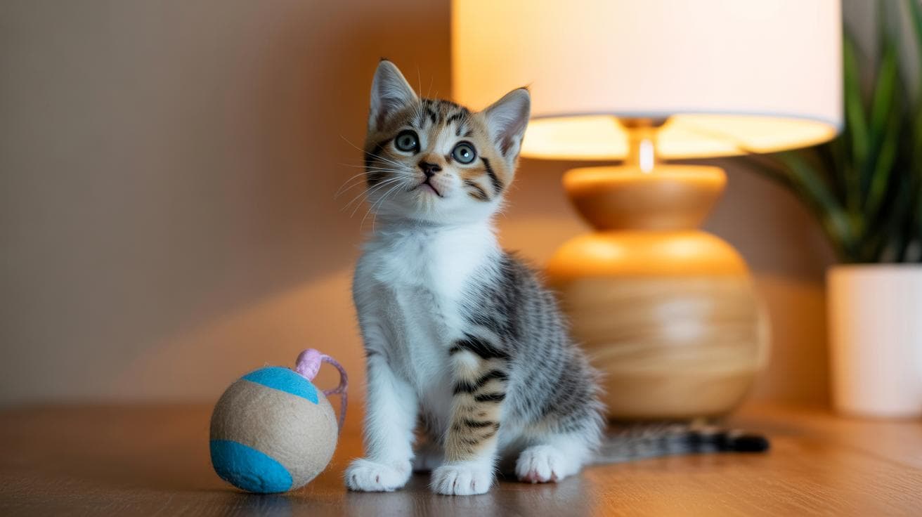
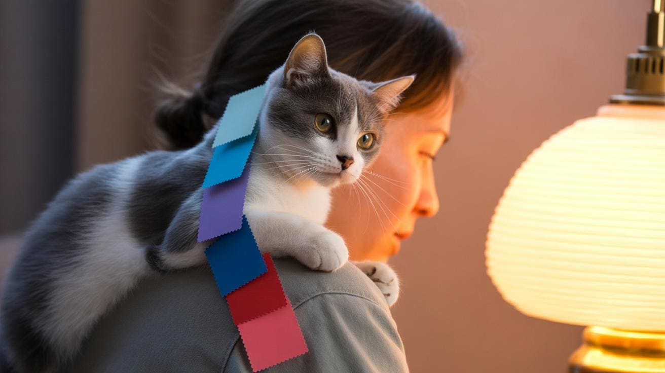
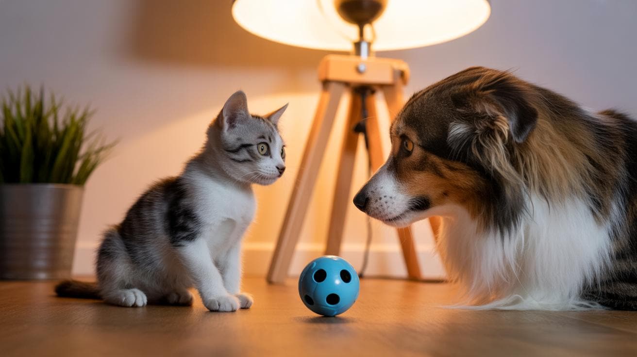
- Blue – This one pops for most cats. It looks clear and distinct, so blue toys and markers are a safe bet. Your kitty will likely notice a blue ball from across the room.
- Blue-green / Teal – Often reads like blue to a cat, just with a slightly different brightness. Great for indoor toys when you want something that still stands out. (Example: A teal ball will look bright against carpet, much like a blue one.)
- Green – Cats see it, but it usually looks more muted than blue. Think soft green, not neon. Good, but not the top attention-grabber.
- Yellow – Shows up better in strong light. Use yellow for daytime play when sunlight or bright lamps make it brighter.
- Purple – Often appears blue to a cat, so purple toys usually read as blue rather than a separate hue. (That purple mouse? Your cat might file it under blue.)
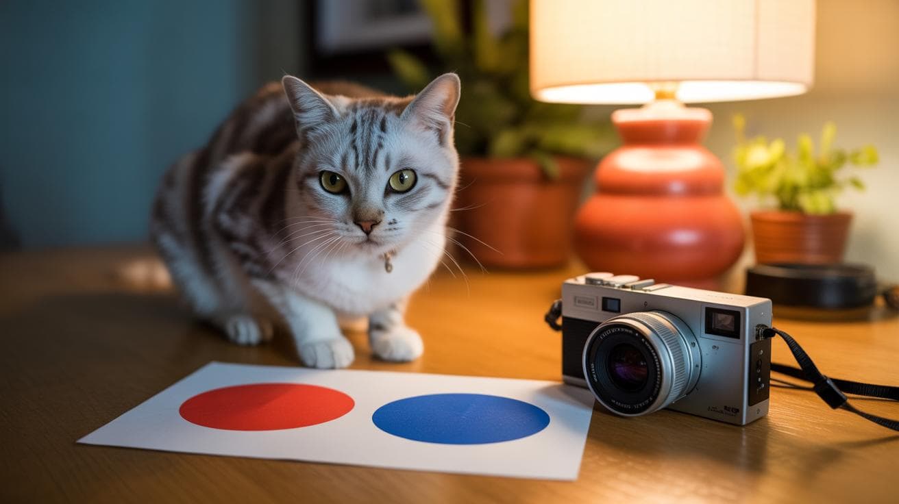
- Red – Tends to look dark, dull, or grayish instead of bright red. Don’t rely on red alone if you need high visibility.
- Pink – Frequently shifts toward gray or a greenish-gray in feline vision. Focus more on contrast with the background than the pink itself. (A pink toy on a light rug may vanish; try dark trim so it stands out.)
- Brown / Gray / White – These neutrals are mostly decided by contrast and brightness, not color. High-contrast pairings make them easy to spot.
| Color (human) | How it likely appears to cats | Practical note for owners |
|---|---|---|
| Blue | Clear, distinct | Reliable top pick for toys |
| Blue-green / Teal | Blue-like with different brightness | Good indoor visibility |
| Green | Muted green tone | Less vivid than blue |
| Yellow | Visible in bright light | Use for daytime play |
| Purple | Usually reads as blue | Pick blue for clarity |
| Red | Muted, dark, or grayish | Avoid relying on red for visibility |
| Pink | Shifts toward gray/greenish-gray | Prioritize contrast over hue |
| Brown / Gray / White | Neutrals where contrast rules | Pair with contrasting backgrounds |
Cat vision vs human and dog vision: concise comparative points (refer to physiology)
This is a short species comparison. For anatomy and citation details, see How cat color vision works.
Quick example: a toy that looks crisp to you across the room may look soft to a cat at 6 meters, so motion matters. Ever watched a cat ignore a bright toy until it twitches? Yep.
-
Visual acuity / distance (visual acuity = how sharp details look): cats see clearly up to about 6 m (20 ft). Humans see much farther, roughly 30–60 m (100–200 ft). So tiny patterns or fine print that you notice from across the room will blur for a cat. (See How cat color vision works for citation details.)
-
Field of view differences (field of view = how wide each eye can see): cats about 200°, dogs about 240°, humans about 180°. That wider sweep helps dogs spot things to the side, while cats keep a balance between forward focus and peripheral awareness for stalking.
-
Low-light performance: cats pick out shapes and movement in much dimmer light because their retinas have lots of rods (rods = light-sensitive cells). They also often have a tapetum lucidum (tapetum lucidum = a reflective layer that boosts low-light vision), which gives them an edge at dawn and dusk. Numbers and test details are in the physiology section.
-
Motion detection and hunting specializations: cats are tuned to fast motion and depth cues for pouncing. So a small, moving toy will beat a faint color contrast every time. Think fishing-rod play: a quick twitch, a satisfying thud, and they’re hooked.
-
Dogs vs cats: both are dichromats (dichromat = two cone types for color), so their hue range is limited compared with humans. But contrast, field of view, and acuity differ enough that a toy that “reads” for a dog may look different to a cat. In short, color alone isn’t the full story. (See How cat color vision works for citation details.)
Practical takeaway: pick toys and collars that prioritize motion and strong contrast more than subtle color shades. For color specifics and more numbers, see Colors cats see best and How cat color vision works. Worth every paw-print.